Websites (again)
So I need a Stacia Kane website. Gotta have one, gotta get it all set up, laws yes. M-O-O-N, that spells I'm screwed!
(BTW, I'll have some news about Personal Demons next week--and I'm going to post excerpts Monday and Wednesday! So make sure you come back and get your sneak peek!)
See, when I set up the DQ site, I was just playing. trying to do something dramatic and maybe a little sexy, something fun. Great.
But, much as I like the site, I need a different look for the SK site. And I've been hearing a few things about author sites lately that hae made the process even more confusing.
For instance, I hear the black-and-red theme, especially for urban fantasy writers, is getting a bit dull. And the white writing on a black background isn't easy on the eyes.
So I need a light-colored background. But I'm not, as you all know, a fan of pastels. And gray, which I really like, seems a bit monochrome, maybe? I don't know, I might try it.
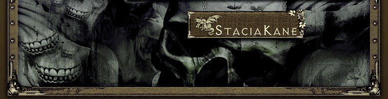
I want to create a cool logo, but I'm absolute crap at that stuff. Seriously. My artistic design skills are about on a par with my six-year-old's. I can decorate a house nicely, but placing photo elements and making it look all sexy and cool is so not my forte.
So I'm all in a dither, and I'm spending more time thinking about the damn website than actually writing, and...ugh! But web designers are expensive, and I have all the tools and everything. I just need a little inspiration.
I am excited about the site, though--it's going to be big, and chock-full of stuff. Character bios, deleted scenes, free short stories, more info about the supernatural world of the books, sneak previews, bookstore listings...all kinds of things, and hopefully it will be a lot of fun.
Any suggestions for me? Any sites you know of that you think are especially nice? Any suggestions of stuff to avoid (aside from the obvious--I will NEVER put background music on my site!)


27 comments:
Trust your instincts - which are good.
Remember, you can always change it.
Rather than the look, what kind of mood do your Stacia books have?
True, Bernita, I can always change it. That does ease the frustration!
Hmmm...sexy, snarky, spooky, I guess. Now how do I convey that? :-)
Free web templates are your best friend.
http://www.freecsstemplates.org/
Holy shit, Mrs. Giggles visited my blog!!!
Thanks Mrs. G--good stuff on there. If I can figure out how to use them I'll be in great shape. :-)
I want a website myself, December, but I am not technologically savvy. If I find someone who is, I'll direct you to their site...
I love Melissa Marr's artwork on the opening page. And, you can see that grey isn't all that bad. It's what I'd choose. You can get a greenish grey, a brownish grey, or whatever.
And thank god no muzac on the web site!! Bless you!!
I am considering learning html but the big fat book I bought is scary. It's easier to do than it looks, though.
http://www.melissa-marr.com/
Forgot the link!
White script on black is a pest. I often copy longer posts into my word folder to read them.
I have a friend who does most of my banners and icons. Maybe you know someone who is good at that stuff? There's nothing wrong with hiring out parts of your webdesign, though personally I would want to be able to tamper with the site myself. But then, I learned HTML back in the days where you had to hand-encode every single damn tag, and woebegone you forgot to close one. :)
Good luck.
This author's website is real basic and still has a real professional look.
http://www.tessgerritsen.com/
I am good at this! I love graphic design. I dunno if you've peeked at my website (www.michelelee.net) but I went with plain white background and plain black text. I would so love to help you. Is there any color you absolutely hate?
How does this look?
I was going to make a few more, but I really like how that one turned out.
Good call on the no-music stance. Music's a sure way to get me never to revisit a site.
And don't pay too much attention to this season's 'must haves' and 'must not haves'. Web fashions change almost as quickly as clothing fashions. Build what you like and set yourself a timetable for updating (say, every spring and fall, re-evaluate your template/colourscheme/graphic and indulge in just enough spruce-up to keep it fresh without turning off your regulars).
KISS - keep it simple, stupid. Black text good. A good font can go a long way to making the plainest web site interesting. Not too many crazy graphics. Clear structure and menus. When in doubt, less is more!
I learned HTML years ago to design a site (no longer around). It wasn't that bad. Not that I can remember any of it now.
My personal preference is to emphasize readability in the site design and trust in the content for interest. If you make it easy to read and pleasant to hang out in, avoiding anything annoying (like music [shudder]) then that's most of it I think.
More annoyances: anything blinking or continuously animated. Any dayglow colors; even darker colors like purple are hard to read when they're neon-bright. Any photo used as a background for text; some of the text will fade into the background here and there, turning it into a secret decoder puzzle.
Any formatting which eliminates spaces between paragraphs is annoying; even indents don't help. There's a difference between quiet, restful text on a paper page and text which (even if it's black) is literally glowing into your eyeballs. Spacing helps.
If you really want something other than black and white for the text and background, keep colorblind people in mind. My husband and a couple of friends all have color-vision problems to one extent or another and they just shrug and move on when they can't read a weirdly colored web site. Sure, they could copy the text and paste it into a WP document or something, but they shouldn't have to.
I'd go for a nice graphic banner across the top if you want one -- maybe different ones for different pages, if you're going to have some static pages? -- and then everything below that just basic, clear and readable. What you blog about is what'll make people come back over and over, not any whiz-bang site design, and you've already got that part down.
Angie
Thanks, Demon Hunter! That site Mrs. Giggles gave really had a lot of stuff, some of it bite-your-fist gorgeous, too.
Wow, Written, that site is gorgeous! I'd love to have something like that, but don't think I can afford to hire someone to do it. :-) So I'll start more basic and upgrade later, I think. It's definitely something to keep in mind, though.
That's a good idea, Camille. I'm actually thinking about redesigning the DQ site and this blog, to keep the colors of both sites more in tune (and also because of the black background/white text thing.)
Whoops, I skipped a few!
Gabriele, I'm waiting for the moment on a banner design, because my editor and I are talking about branding a bit and logos, so I want something that will be readily identifiable always with the books. :-) But I'll definitely need some help when it comes to that one.
Oh, yes, Bernard, Tess Gerritsen's site and blog are great, aren't they? I love her.
Wow, Michele, that's really nice!! We are holding on for the moment as far as a banner goes, because I want to see what the look is for my cover, but I love that! Could you come up with something for the DQ site--maybe a burgundy, or blue? I like blue. (Not a fan of pink, or pastels.) If you have the time and inclination only, of course, but I'll credit you on it if I use it.
Lol McKoala I hate forgetting that stuff! On my desktop I have a whole bunch of really cool fonts I found online, I plan to use them on the new site if possible.
Right now, Angie, I have a flame-backed homepage, but the other pages are plain gray (gray is my favorite color.) Except one or two, which I may change. It's tough when you don't like pastels but have to make the colors light enough to read over.
Sigh, I do have time...
bernita's got it right.
Plus, you already know you're not going to be a sheep about it -originality goes a long way. -V95
People email me at random to tell me how much they like my Ann Aguirre site. And in fact, my website helped me stand out from the herd when I queried my agent initially. When she asked for a full, she also said, "And may I say, you have just about the
coolest website I have ever seen. I totally love the look of it."
Deena does amazing work; she even did original artwork for me -- character concept art for my leading ladies. She's totally worth the price and a fraction of what you might expect to pay.
(But wait, there's more... if you act now...)
Sorry to sound like an Infomercial, but she's fantastic. Email me if you want more info about prices and stuff.
Try this one.
I rather like messing around with things like this, so don't feel like you're imposing if you want something changed or anything. I'm currently on a bunch of rest giving a pulled muscle in my leg time to heal so I'm stuck on my butt anyway. :)
Here is the background.
I think grey is a good background colour - you can add more 'spark' elsewhere.
good luck with it!
The black on grey is immediately easier for my eyes to read. Sorry...
Originality...sigh, V95, most days I don't feel like I have any of it at all...
Thanks, Annie! Your site is gorgeous, and wow, she has done some beautiful work for other people, hasn't she? At the moment I can't afford her (at least according to the rates on her site), but one of these days...
Oops! Michele, I didn't see that! On a whim last night I decided to see how blue and gray looked, and at the moment I'm pleased with it--it occurred to me I'd used burgundy and gray last time so I wanted to try something different. Not sure if I like the banner I cam up with, but it'll do for the moment anyway. Thanks though, the banner and background are beautiful!
At the moment the new site has a pale greenish-yellow background, Rebecca. We'll see if it stays--it's version 5 or 6 so far. I did one with green and orange that was beautiful but I don't think it suits the feel of the series. I may post a picture later anyway though. :-)
Don't apologize, McKoala, I'm glad this is easier for you! That's the point!
M-O-O-N, that spells I'm screwed
LOL. The main things (IMHO) are legibility, interesting content, and ease of navigation.
Branding your site to the theme/tone of your books is an excellent idea.
I'm actually busy procrastinating doing that exact thing... =)
no problem :) I like the blue too. Especially in this 15 degree heat!
Procrastination is such hard work, isn't it Erica? *sigh* It's exhausting.
Thanks, Michhele, and thanks again! Those were really lovely!
Post a Comment